APAA – Australasia Property Advisory Association
Category
Description
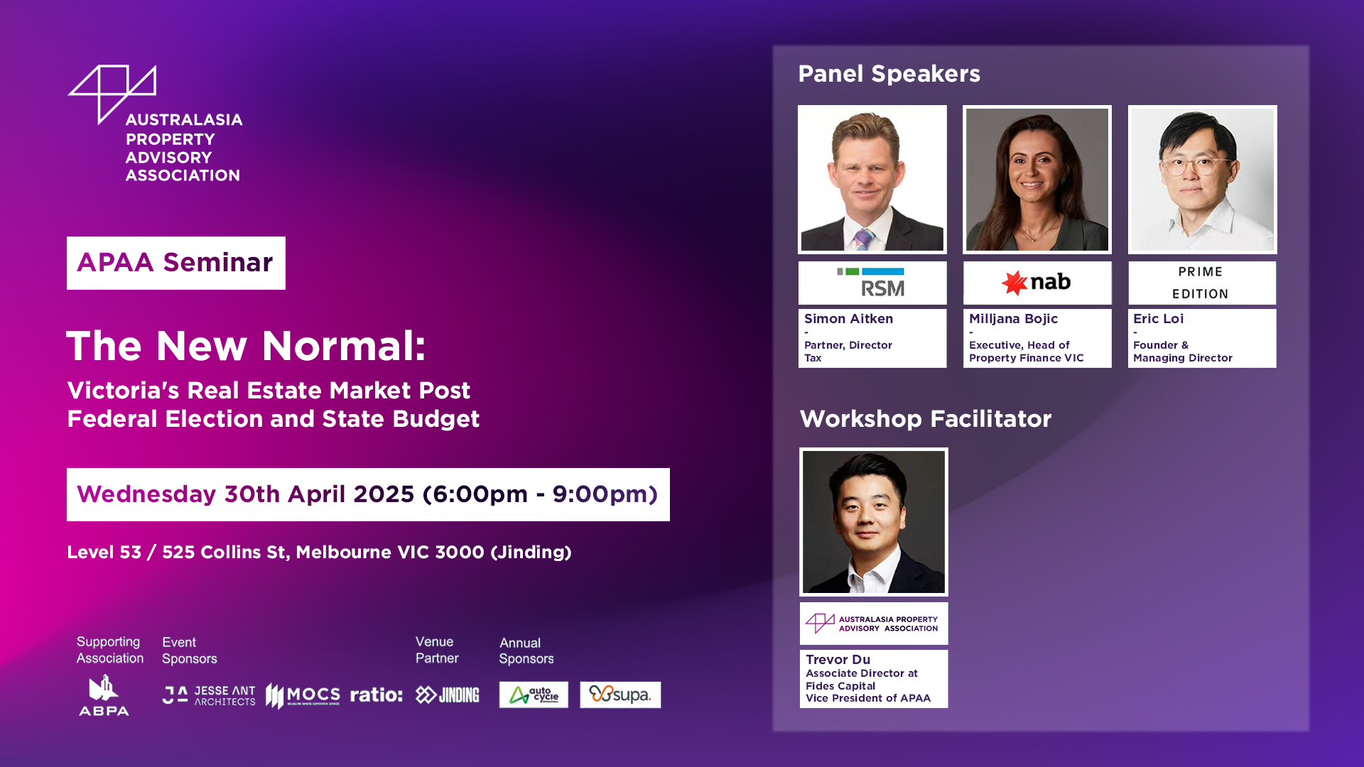
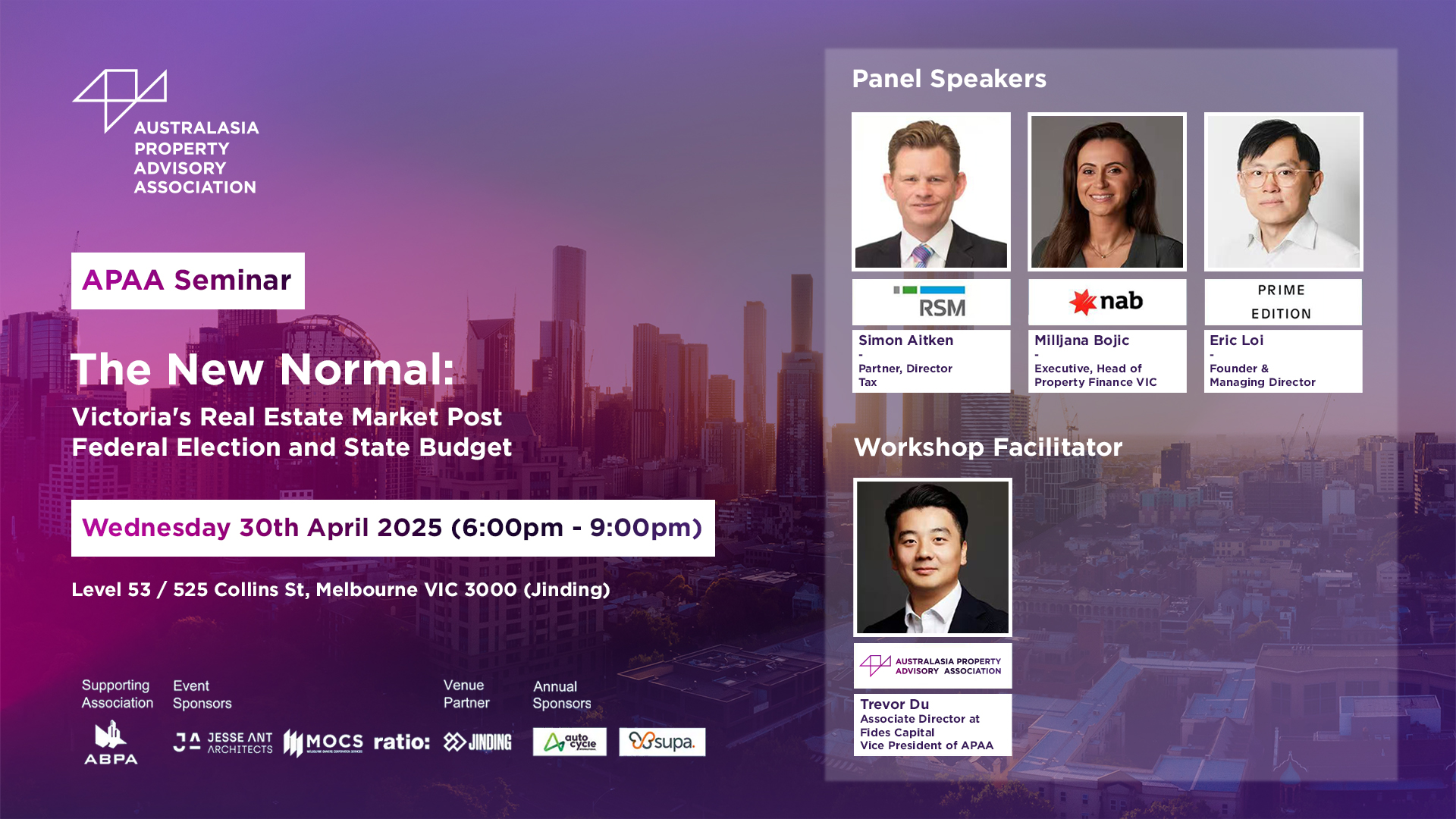
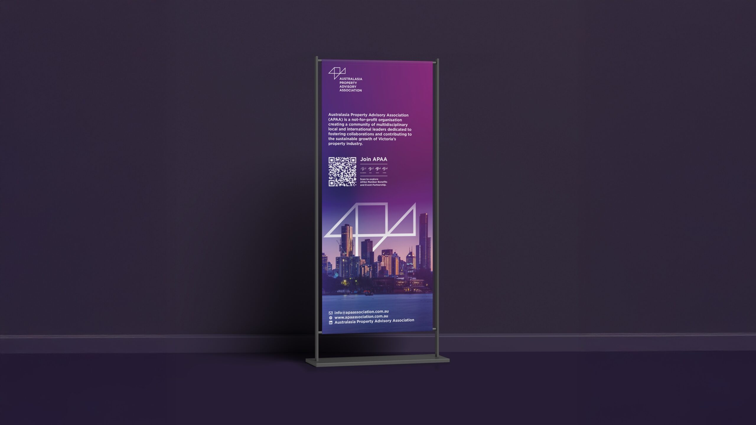
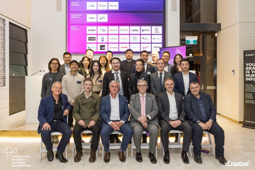
Since 2018, xCreative™ has been the Supporting Sponsor of APAA, working closely with the association on its visual identity. We designed APAA’s first logo, inspired by the tangram, a geometric puzzle of three triangles and one square. The shapes abstractly form the letters “A”, “P” and “A”, and echo the structural geometry of architecture and construction, the industries APAA connects.
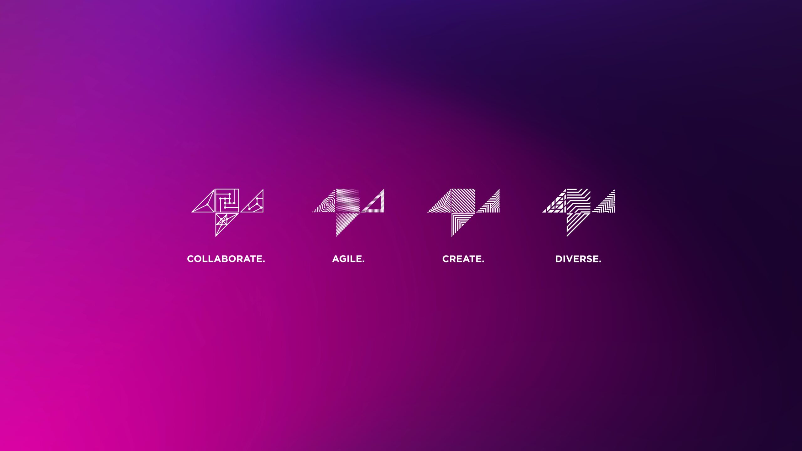
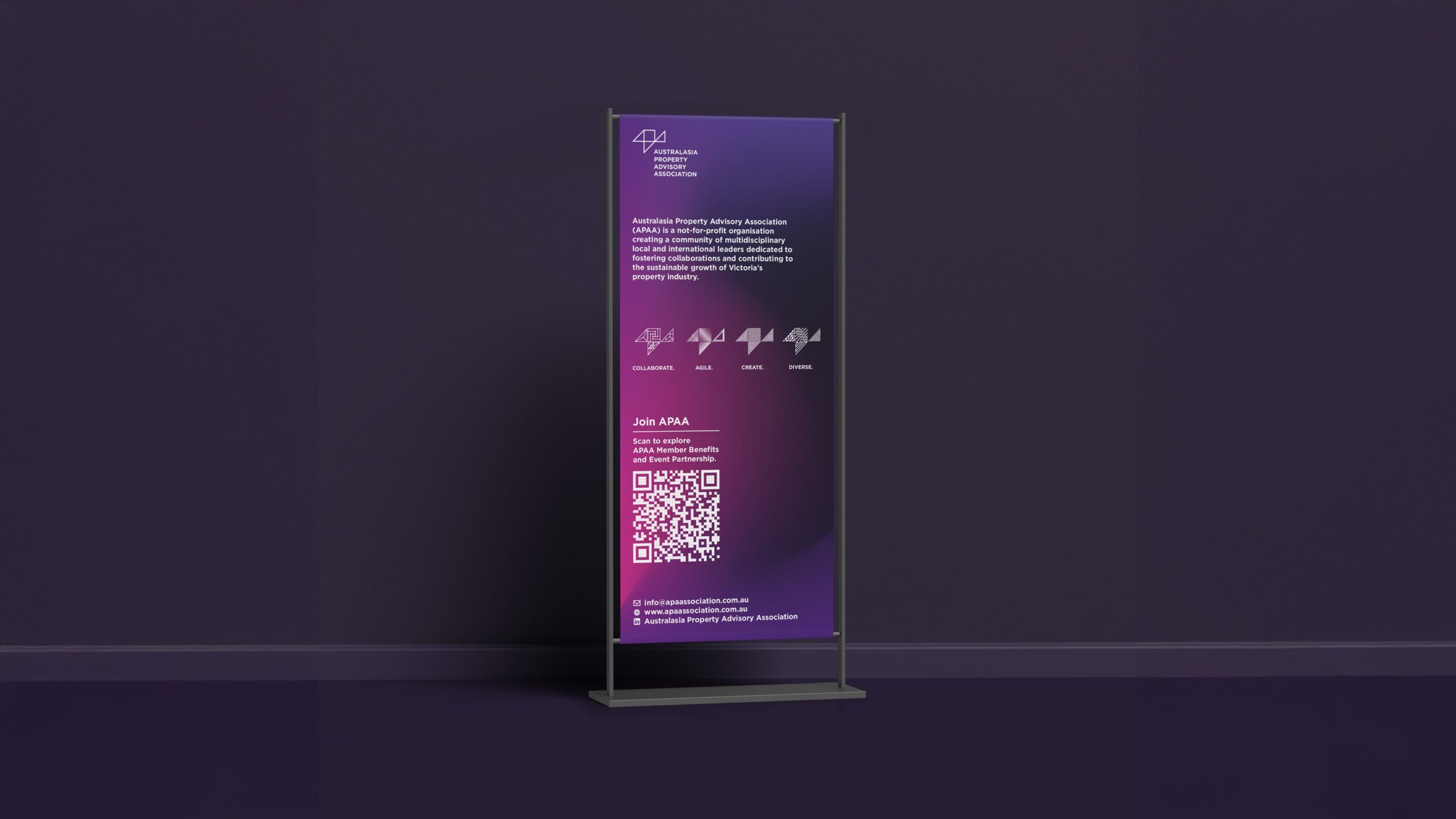
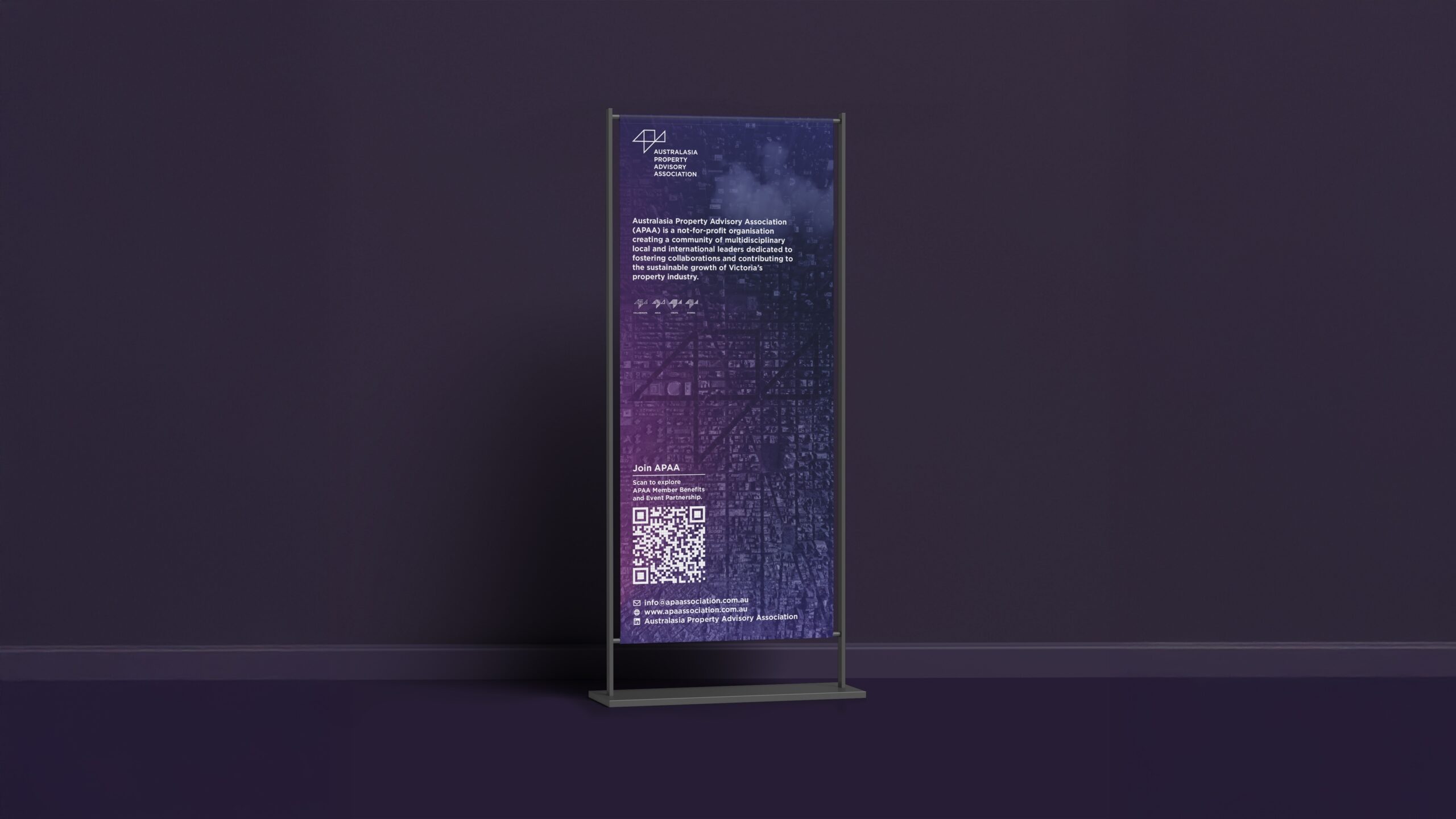
In 2025, as APAA evolved, we led a full rebrand. The new logo keeps the core tangram form and introduces a gradient flowing from magenta red to deep twilight blue, merging the original two brand colours into a single mark. We also created four animated variations of the logo, one for each of APAA’s core values: Collaboration, Diversity, Agility and Integrity.
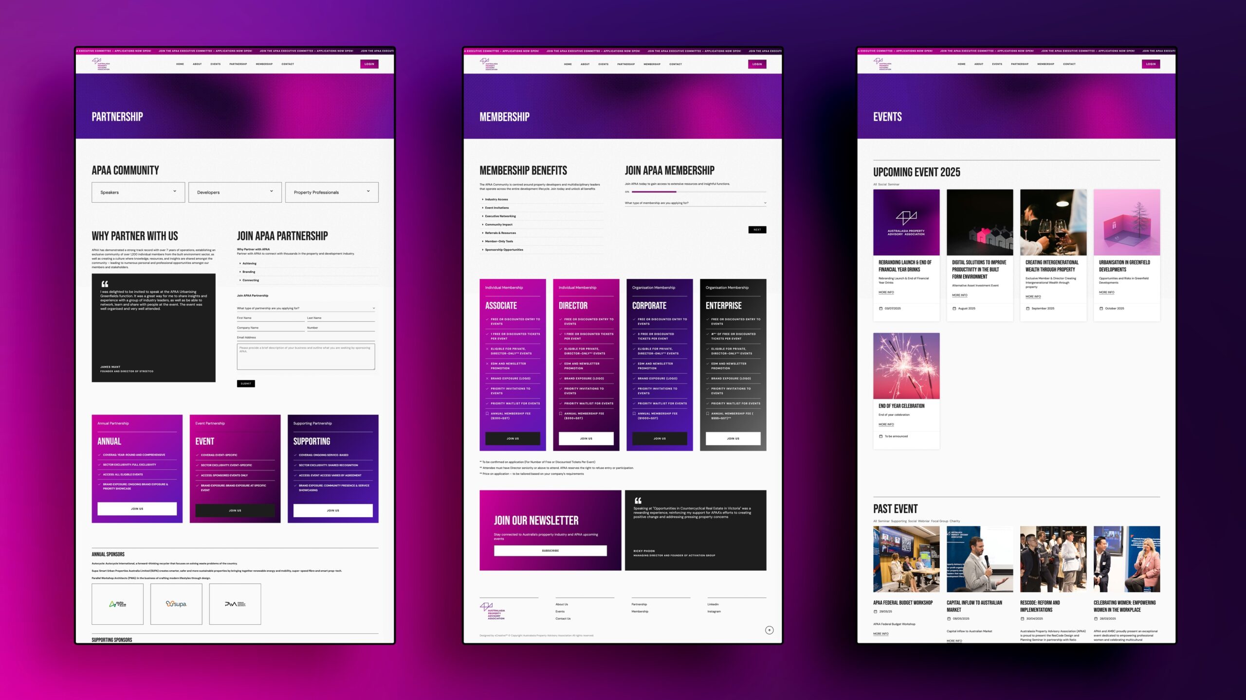
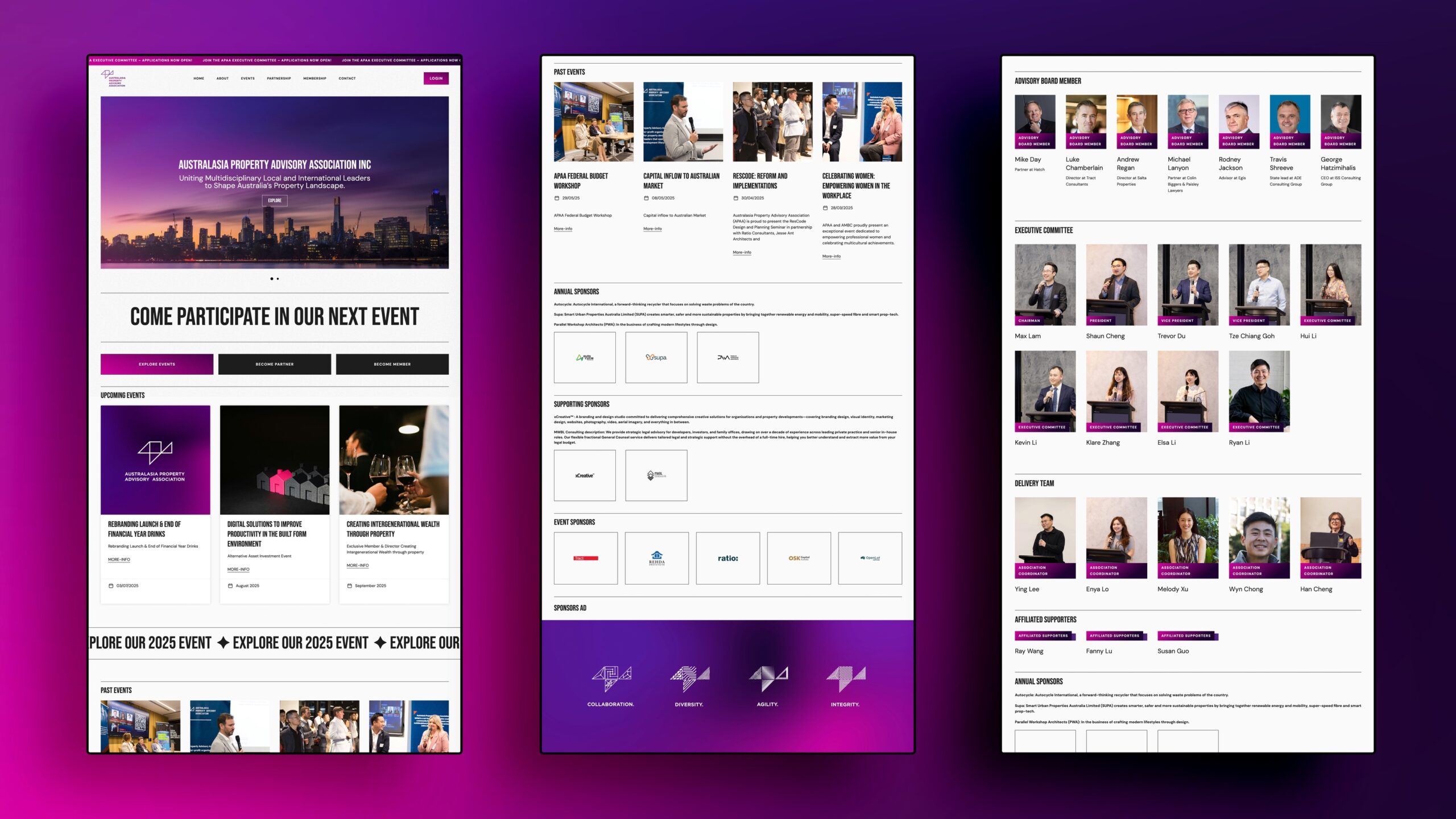
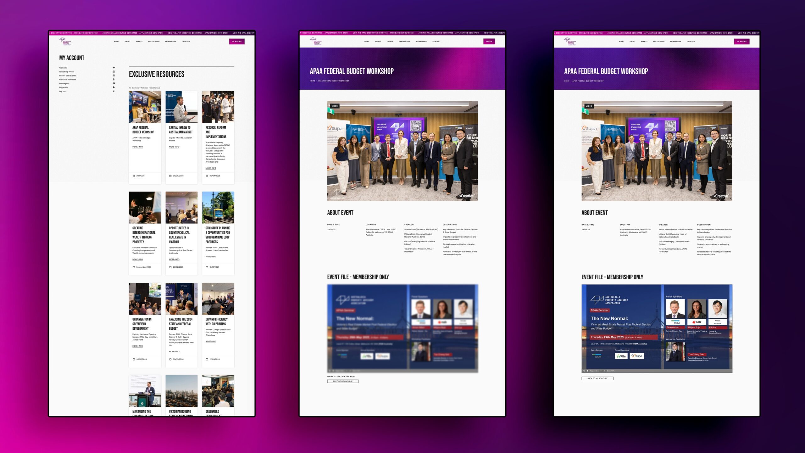
Alongside the rebrand, we designed and developed the new APAA website, carrying the updated identity into a clean interface with online membership registration, member login and exclusive resource access, with more features planned as the community grows.
Seven years of partnership so far: from APAA’s first logo to its rebrand and full digital platform.
Explore more at apaassociation.com.au.
Deliverables
Brand identity, logo design and website design.
Outcome
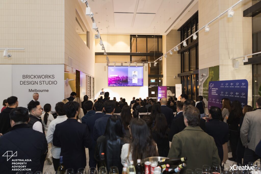
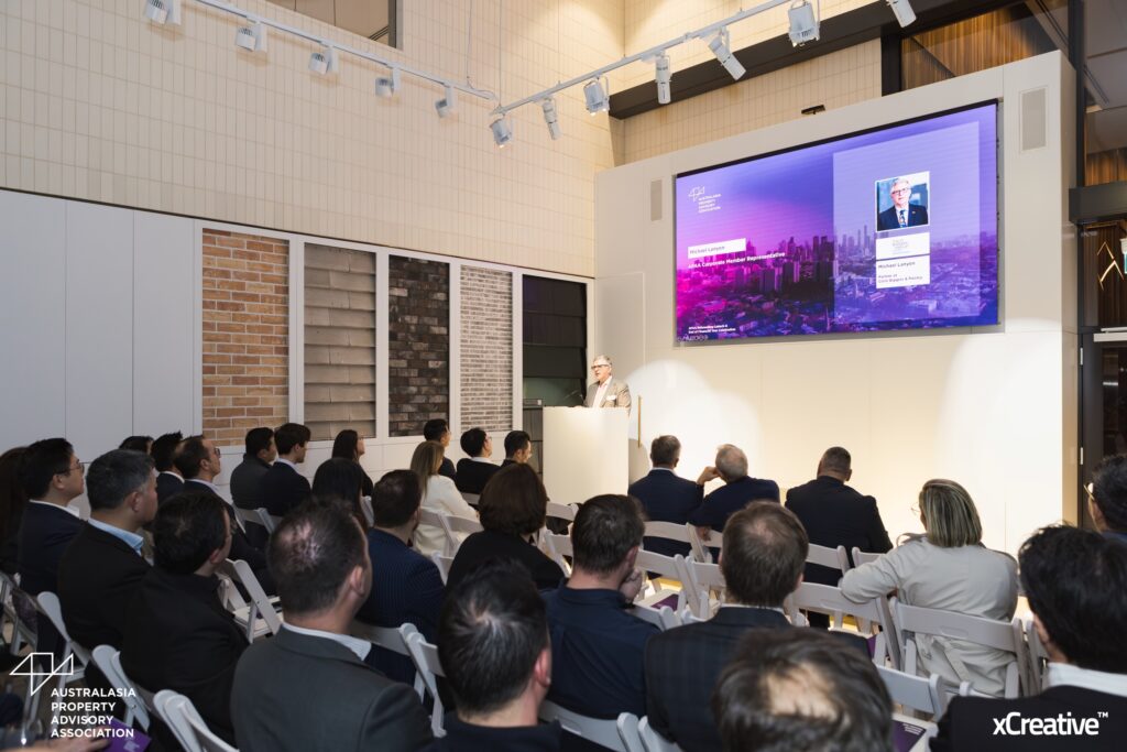
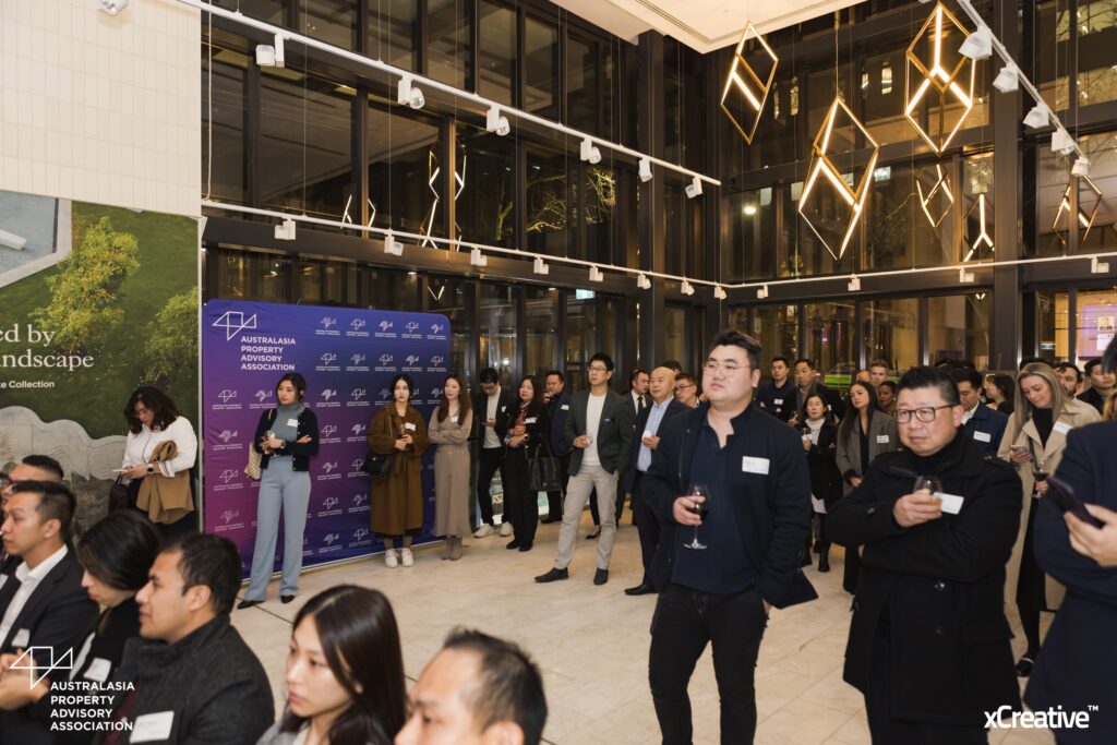
We have been APAA’s Supporting Sponsor since 2018, and the identity has carried the association’s events, publications and member communications for years. That length of tenure is its own result: the brand still fits as the association grows.