Circle Student Community
Services
Description
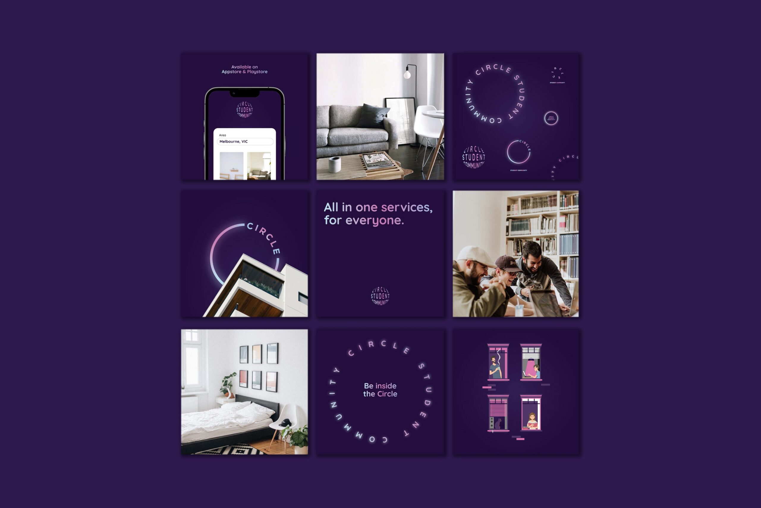
Circle Student Community is built around a single idea: a circle, the symbol of unity and belonging, broken and turned to form the letter “C”. The gap in the circle is deliberate. It reads as openness, an invitation for students to step in.
The identity pairs curved shapes with rounded typography and a fresh, youthful palette of soft but vibrant tones. The “C” motif repeats across social media graphics, student merchandise and environmental branding, keeping the community recognisable wherever it appears.
One familiar shape with a typographic twist gives Circle a brand that is simple to read and easy for students to make their own.
Explore more at circlestudent.com.au
Deliverables
Brand identity and social media collateral.
Outcome
The broken-circle mark gives the community a symbol members recognise instantly across events and social channels. It reads correctly at avatar size, which is where a student brand actually lives.