The Bellevue
Category
Description
A Brand Framed by Architectural Elegance
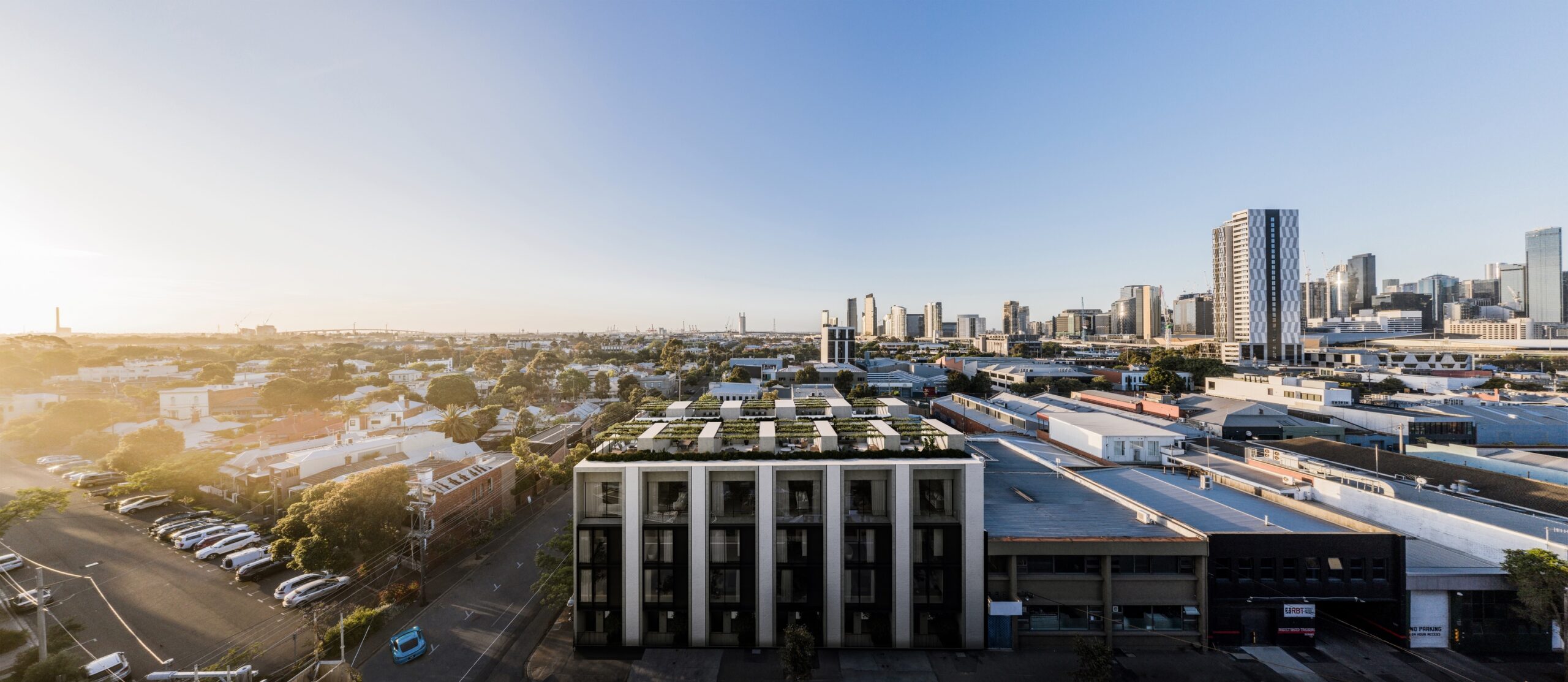
BelleVue means “beautiful view” in French, and the development lives up to its name with vistas over South Melbourne toward the coastline. The brand identity was built around that single asset.
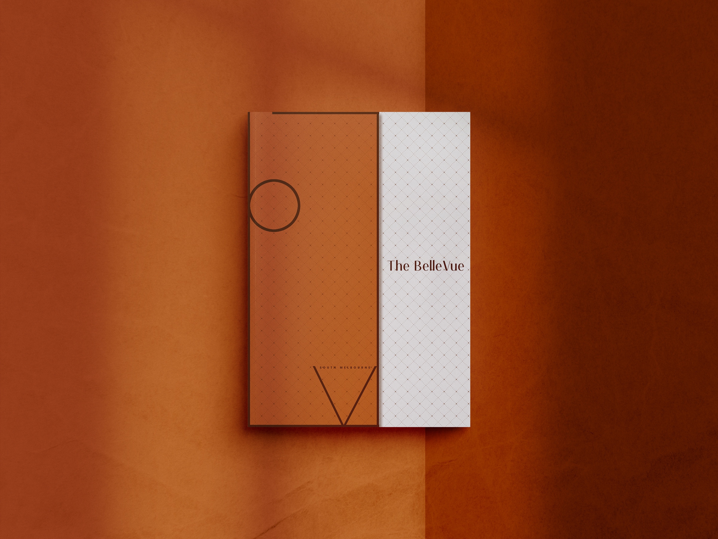
The logo is a BV monogram shaped into a window frame, literally framing the view. The brochure takes the exact shape of the logo and opens with a half-open cover, a physical reveal that mirrors what the development sells.
The website follows the same philosophy with cinematic imagery, refined animation and smooth navigation that immerses visitors in the outlook before they ever visit.
One idea, the view, carried without dilution from monogram to print to screen.
Explore more at bellevuesouthmelbourne.com.au
Deliverables
Brand identity, logo design, website design and marketing brochure.
Outcome
The campaign sold the view the name promises, with South Melbourne vistas carried through every piece of collateral. Buyers understood the offer in seconds, which is all the time a project brand gets.