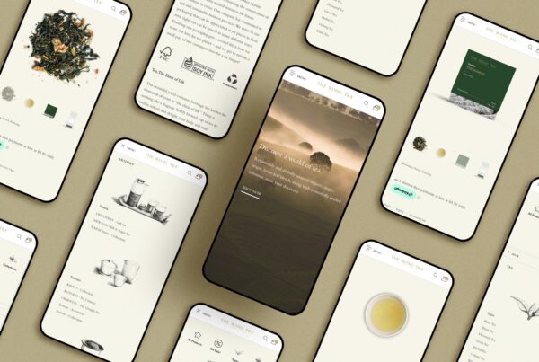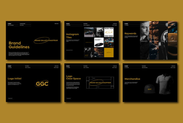
The best real estate brochure design does three jobs. It makes the buyer keep it after they leave the display suite or open home, it lets them find their home, its floor plan and its finishes without an agent beside them, and every image in it is an honest picture of what will be built. A good brochure runs in a clear order (location, building, homes, finishes, team), uses floor plans buyers can read and labels every render properly. xCreative™ designs property brochures in Melbourne for off-the-plan projects, land estates and boutique developments from our Chadstone studio.
Two kinds of real estate brochure
A listing brochure for an established home is a short piece an agent hands out at an open inspection: photographs, the floor plan, the key facts and the agent’s details. The design job is clarity and good photography. An off-the-plan project brochure is a different product. The buyer cannot walk through the home, so the brochure, the renders and the floor plans stand in for it. Consumer Affairs Victoria’s advice to people buying off the plan makes the same point: buyers have to rely on artist’s impressions, floor plans and advertising material. That is why project brochures carry more responsibility, and more pages.
What to include, in what order
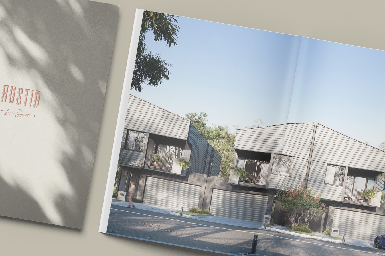
- A cover worth keeping. The cover decides whether the brochure goes home or into the bin. Our Austin Lara brochure, pictured above, uses a tactile cover that echoes the architecture; Kingsley carries a commissioned oil painting.
- Location. What is nearby and how far: transport, schools, shops, parks. Use real distances and name the source.
- The building or estate. The design story, the architect, the amenities.
- The homes. Floor plans with room dimensions, a north point and the internal and external areas, organised so a buyer can find their type quickly.
- Finishes and inclusions. Materials and appliances, with the colour schemes if there are options.
- The team. Developer and architect, then the builder and selling agent, with past projects.
- Disclaimers placed where they belong. Next to the images and plans they qualify, not buried at the back.
Paper and finishing are part of the message. A heavier stock, an uncoated paper or a single foil detail can make a brochure feel like the building it describes, and a cheap, glossy stock can undo good design. Ask the designer for printed samples on the stock they recommend, and allow time for a proof before the full run. Brochures for display suites are often reprinted as stock sells and plans change, so set up the files so a page can be updated without redesigning the whole book.
Agents use the brochure in the suite and buyers use it at the kitchen table, so test it both ways. Can a buyer find a two-bedroom plan in ten seconds without help? Can a partner who never visited understand the location from the map?
Renders must match what will be built
This is where design meets the law. In Ripani v Century Legend, a Federal Court case summarised by Clayton Utz in their note on building development illustrations, purchasers relied on a hero render showing a design feature that the apartment would not have. The court found that neither the words “artist impression” nor a disclaimer on page 96 of the brochure was enough to correct the impression the image gave. The ACCC’s general guidance on false or misleading claims applies to property advertising like any other.
The practical rules for designers and developers: check every render against the current approved drawings before it goes to print, update or withdraw images when the design changes, label artist impressions clearly on the image itself, and put qualifications next to the picture they qualify. A beautiful render that oversells one feature can cost far more than it earns.
Printed, digital and bilingual versions
Most campaigns need the printed brochure and a digital version for email and the project website. Design the PDF to be read on a phone as well as on a desk: plans that can be zoomed, text that is not too small and a file size that downloads on mobile data. Our project websites carry the same content so buyers see one consistent story.
For many Melbourne projects a share of buyers reads Chinese. A bilingual brochure works best when both languages are written and laid out as originals, not translated at the end. Buyers notice which language was the afterthought. The brochure also has to match the rest of the campaign, from hoardings to the display suite; our guide to property development marketing by sales stage shows where it fits.
Questions developers and agents ask about brochure design
How many pages should a property brochure have?
A listing brochure is often two to eight pages. An off-the-plan brochure for an apartment project commonly runs much longer once every floor plan type is included. Let the number of plans set the length, and keep the story pages tight.
Is “artist impression” enough to protect a developer?
Not on its own. The Ripani case shows that a label and a distant disclaimer did not cure a render that showed a feature the home would not have. Keep renders accurate to the approved plans and place qualifications next to the images.
Should the brochure be printed or digital?
Both. The printed piece works in the display suite and on the kitchen bench; the digital version reaches buyers by email and on the project website. Design them together so the content matches.