Starling Estate
Category
Description
A Brand Rooted in Nature and Harmony
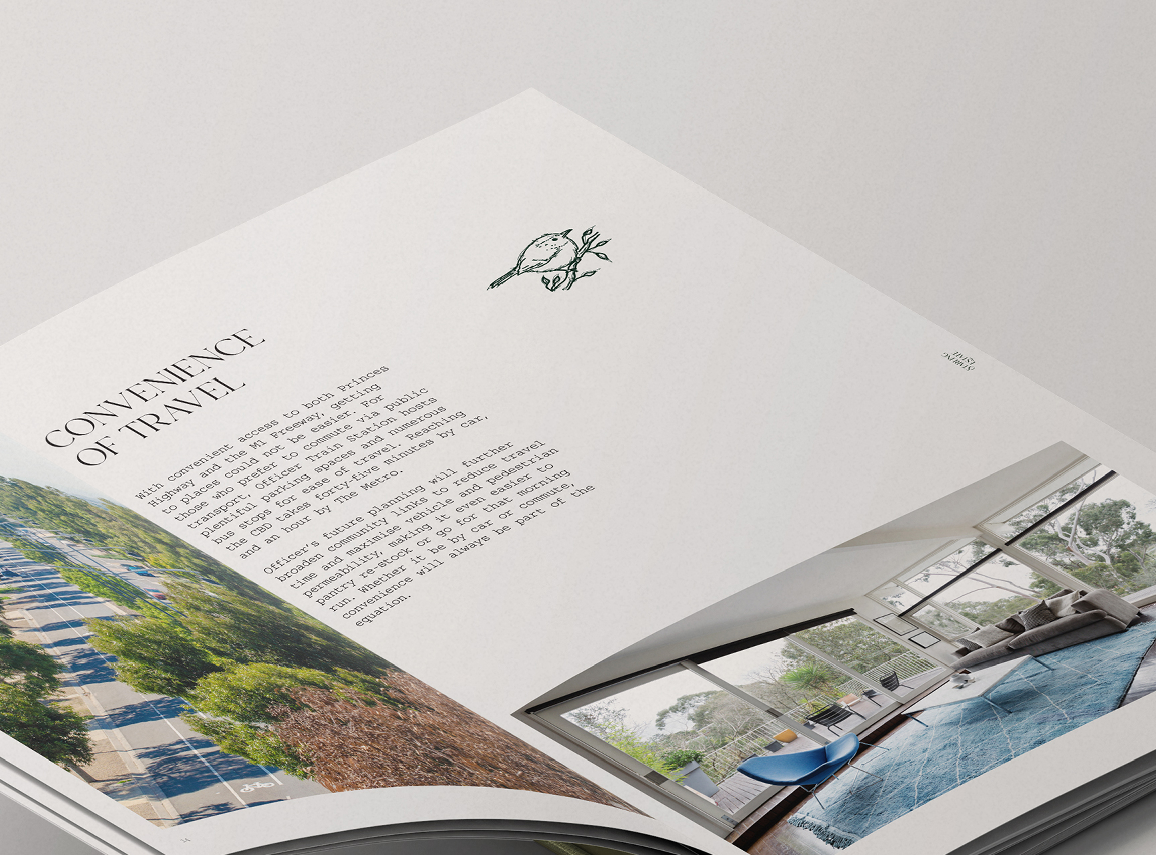
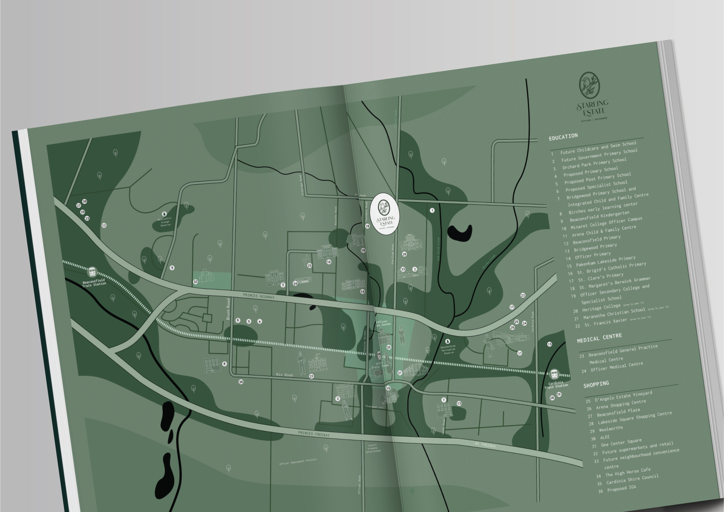
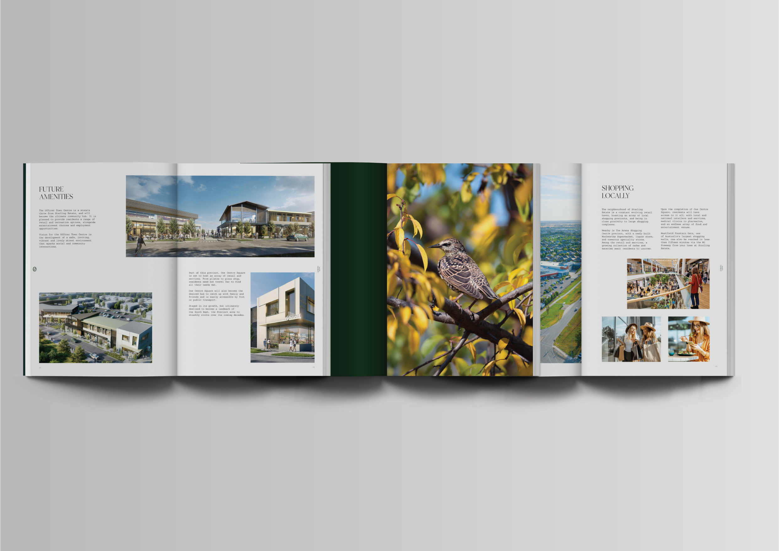
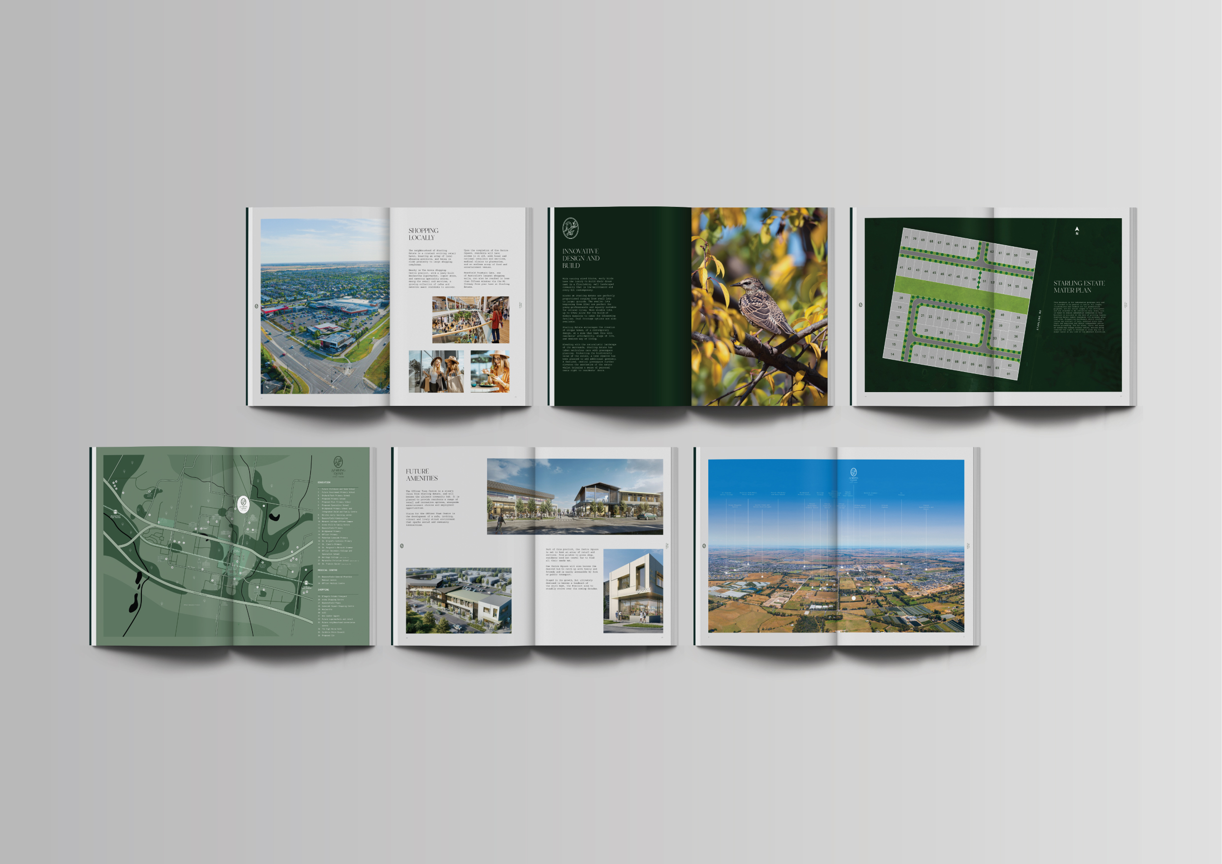
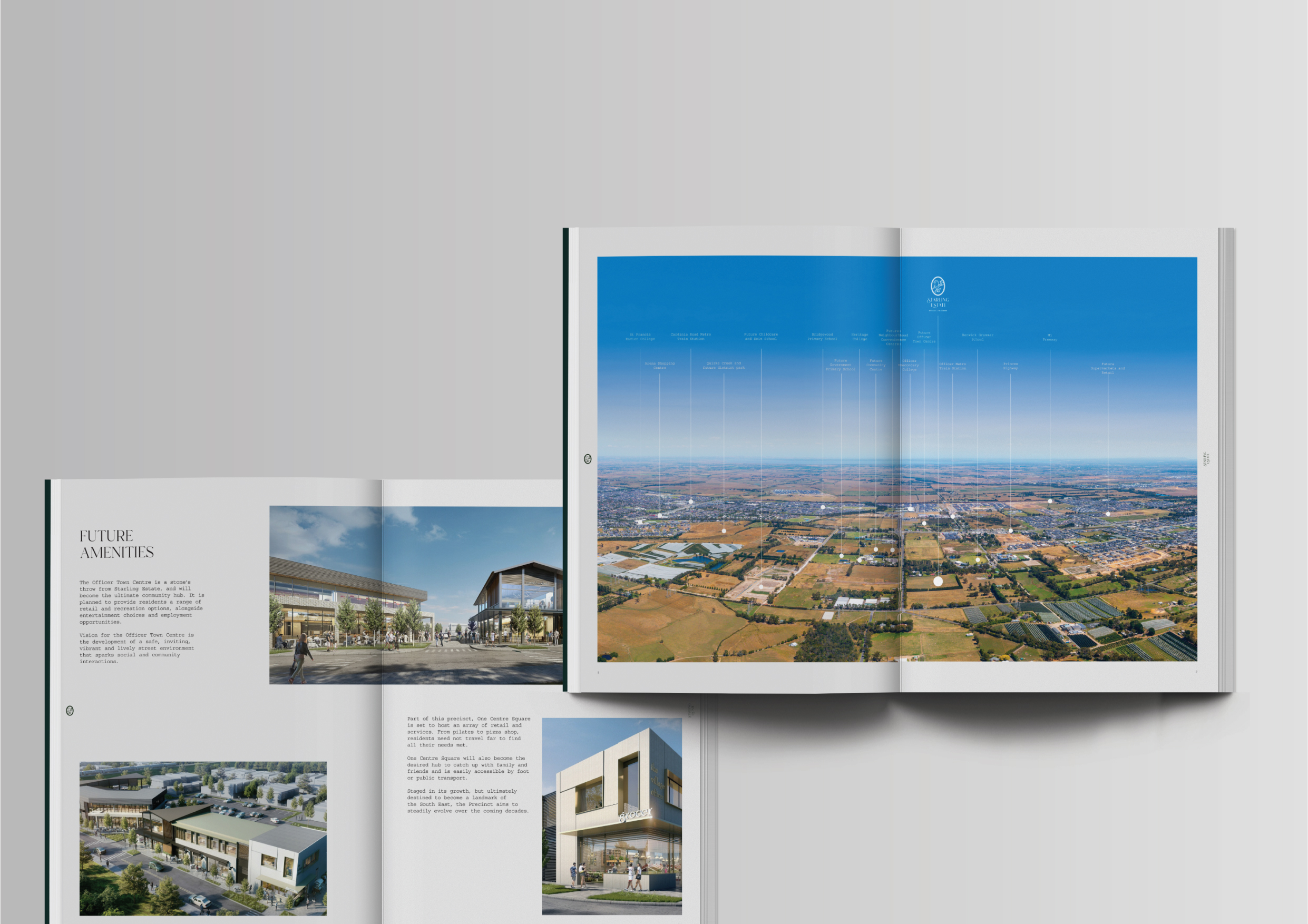
Nestled in Officer, one of Melbourne’s fastest-growing communities, Starling Estate offers a peaceful residential retreat surrounded by lush greenery, open parklands, and thoughtfully planned streetscapes. Designed to integrate seamlessly with its natural environment, this estate presents a rare balance of suburban convenience and tranquil living.
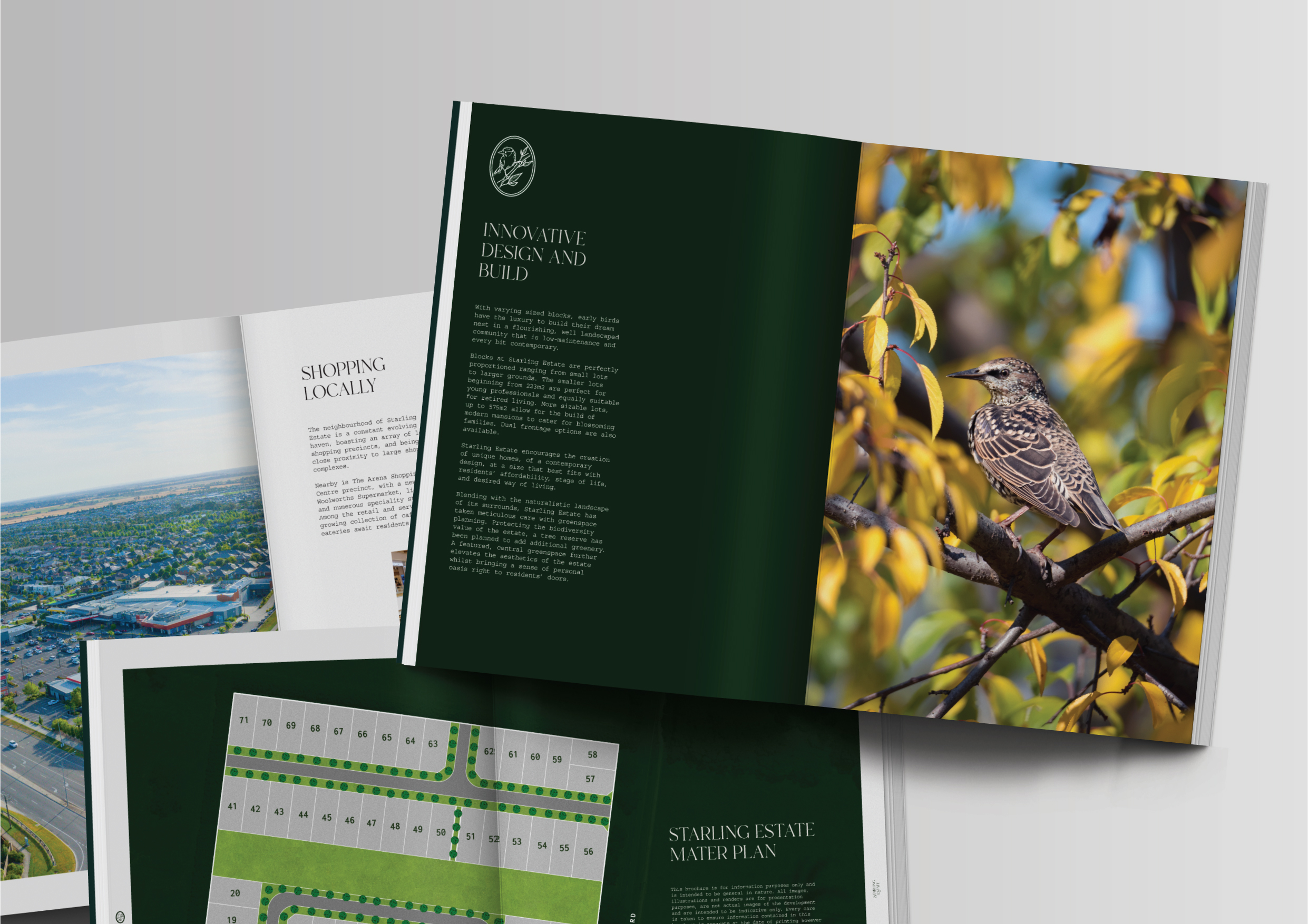
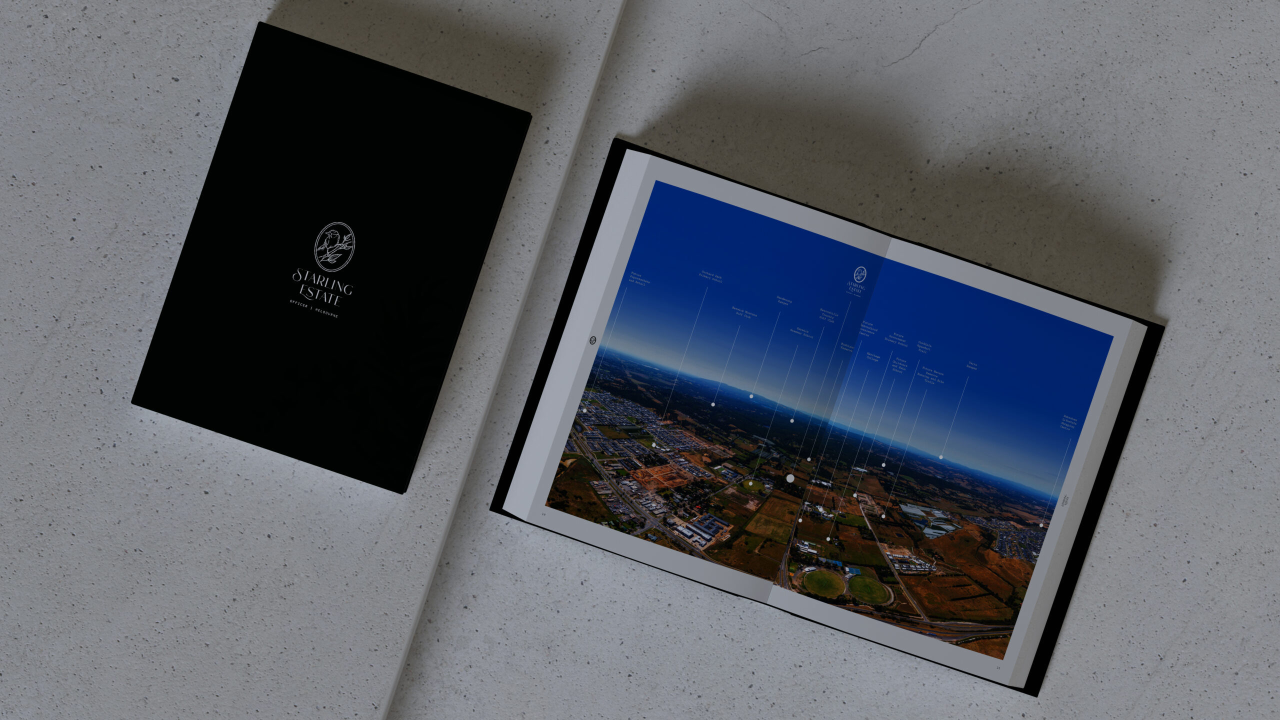
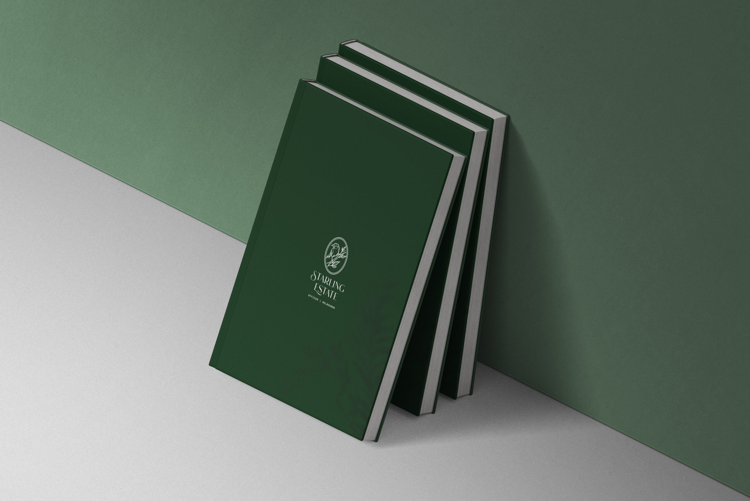
The branding draws inspiration from the starling bird, a symbol of harmony, adaptability, and vibrant community living. The logo features a graceful, abstract bird in flight, reflecting the estate’s connection to nature and its vision for a thriving, dynamic neighborhood. The color palette is soft and earthy, echoing the greenery, water bodies, and natural beauty that define the area.
The brochure design is a visual and tactile experience, shaped to highlight the estate’s livability and natural surroundings. Clean, spacious layouts, immersive imagery, and refined typography create a narrative of serenity and modern lifestyle appeal. Every element has been curated to bring potential homeowners closer to the essence of Starling Estate—an opportunity to build a life where nature and urban convenience meet effortlessly.